
Enlivening engagement through cohesive branding
Summer 2019

Multimedia Branding Standards, Collaborative Iterations
Aiming to boost club attendance and excitement, I led a rebranding effort for my college's User Experience club.
the problem
First, a symptom. The user experience club at RIT has had low attendance since its inception, with a difficulty in attracting new people. Why? You may ask, well it’s a combination of a few factors:
Confusing Name
Formally the club was known as “RITUX a SIG-CHI chapter.” Let’s break that down:

SIG-CHI was the biggest point of confusion. While we were affiliated with the organization at one time, SIG-CHI did not have name recognition on campus. Similarly, while UX is a common term in the industry, those new to the field may not know what it means.
Lack of Cohesive Branding
In the past the RITUX name has had a consistent blue theme. However, advertising efforts were always at the will of the designer. The lack of formalized branding guidelines and different designers resulted in radically different designs each time.

Three designers, three totally different designs
And so, instead of the club working on a UX project, during the summer of 2019, as newly elected president of the club, I set out to overhaul our branding.
first iteration
Wanting to make sure the club name was as clear as possible, I considered the title “User Experience @ RIT.” However, after discussing it with others, we decided that “Club” was important contextual information for advertisements. Given the fact that we were mostly going to be advertising on campus, we also concluded that “@ RIT” was also redundant.

To tie the branding to the UX industry, I wanted to try to have a whiteboard motif. With this in mind, I began to play around with using the handwriting typeface Permanent Marker in orange (to tie with RIT’s branding).

First proposal for the full wordmark and logo
I made a quick pass at the poster designs just to see how the logo would look on them. Following the whiteboard motif, I put some post-it’s on the board as a fun way to catch people’s eye for the monthly poster. For the weekly and online posters however, I struggled to find a style that connects the three posters.

Once these designs were done, the club's e-board had a meeting discussing the current designs with the following feedback.

second iteration
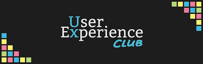
To address the feedback, I decided to take the RIT orange out and replace it with the blue that we had in the old branding. Since the color orange is used frequently on RIT’s campus, I decided blue will stand out more. During this time, I turned the logo into a dark theme so that it would stand out more online (and because it looks cool).
To get rid of the overused and harsh typeface Permanent Marker, I had an e-board member with good handwriting write out “club” with a sharpie. I then scanned in the writing, converted the image to an svg, and cleaned it up. The result was a light and bubbly type that’s legible, but still harked back to whiteboard writing.

Left: Permanent Marker Typeface
Right: Digitized Handwriting
Minecraft curve generators proved useful
To give context to these designs, I sought out the places where the new branding would appear, took screenshots, and then edited the images to feature my designs. When designing the Facebook banner, it seemed empty without some flair. With that in mind, I began to play with adding a graphic to the edges. This resulted in the use of small blocks of color, that resemble pixels and/or post-its.
finalizing poster designs
Once the bulk of the branding was done, I revisited the poster designs. I started out with the designs for the black and white weekly poster. At first, I tried making a dynamic poster, but I found that it took too much time and effort to repeat each week. Instead I pivoted to a design that allowed for a plug-and-play approach. Using icons found on the Noun Project, the final design for the weekly poster allows quick production, but also has intriguing graphics.
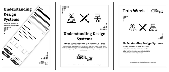
Left to Right: Too Complicated, Too Loud, Just Right
For the online version of the weekly poster, I took the content on the physical poster, but then stripped it down. At first I played with the idea of only displaying graphics, but then found the icons may confuse people so the name of the meeting was added.

Left to Right: Too Simple, Too Weird, Just Right
For the monthly poster, I already had a solid base of using post-its, but the main questions of color and typography remained. I looked at the real colors that post-its come in, but found that with black text, there’s a lack of contrast in the digital medium. Luckily the colors used in the blocky curve graphic worked well with black text and graphics. With the text, a comparison of handwritten fonts was done because the handwriting on the logo would otherwise have to be made into a custom font.

Judging the typefaces on their overall looks and legibility, I ultimately selected “IdWriteItAll.” Adding the icons from the weekly poster to the monthly poster brings together an intriguing, colorful design.

Left to Right: Too Bland, Not Enough Contrast, Just Right
wrapping it all up
For longevity sake, I created branding guidelines to ensure that all the details are not looked over in the future. These guidelines can be viewed in full here. Using these guidelines, designs for business cards and powerpoints have been made quickly and efficiently.
While the results of the rebranding are still to be determined. The club has seen more engagement with freshman and others new to the club. Not only has the rebranding brought more people to the club, but a new wave of excitement for what’s to come at the User Experience Club.
